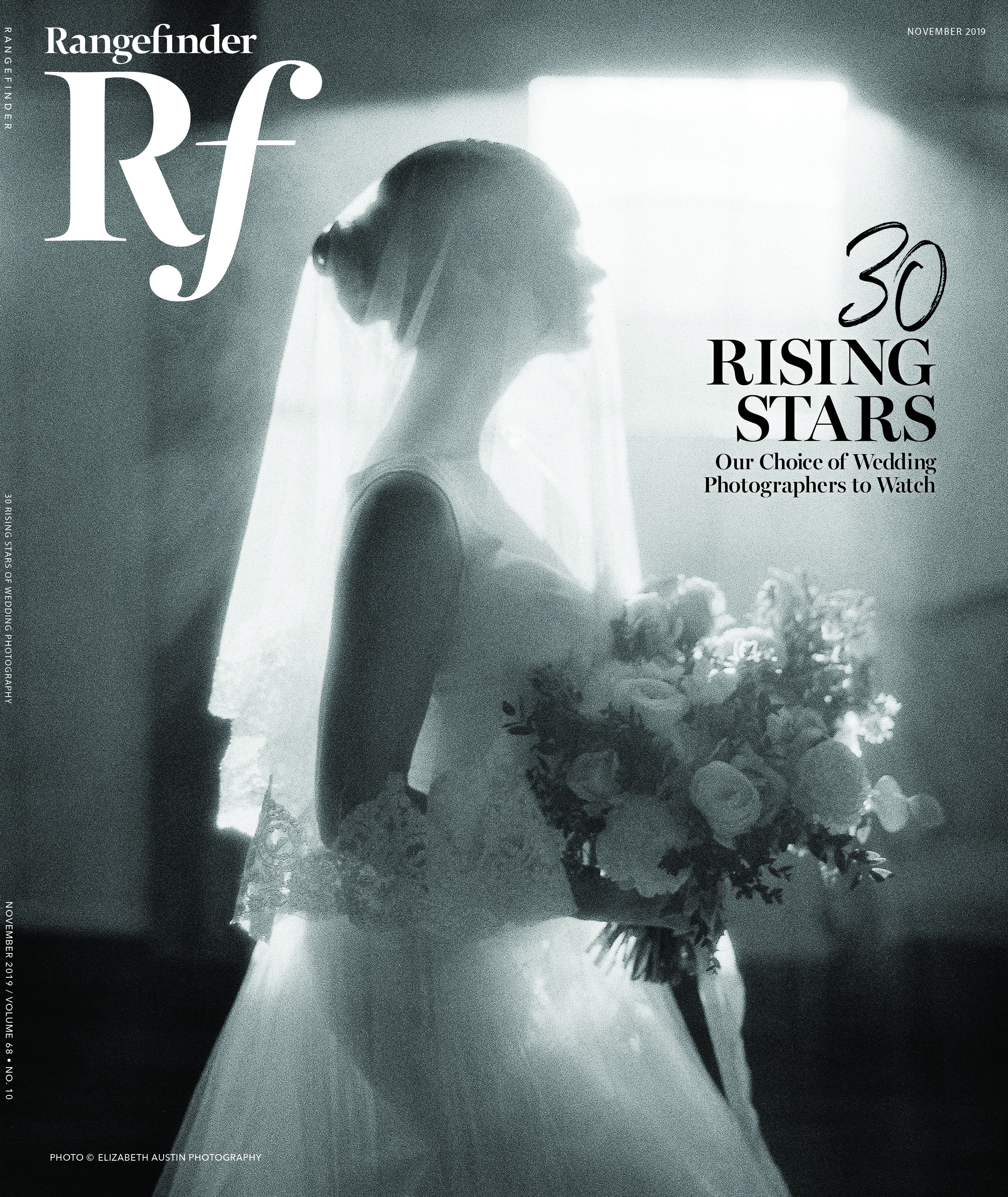
The Hopkins Touch
June 1, 2009
On the chilly December morning when she gingerly rang the doorbell of Will Hopkins’ Manhattan studio, Gray Davis Boone was not a stranger to the publishing business. She was the founder and publisher of Antique Monthly, the venerable, newsprint-format bible of serious collectors. She had also married into the family whose name anoints the Boone newspaper chain throughout the South and Midwest. Boone had proverbial printer’s ink on her hands, but her recent acquisition of glossy Horizon magazine had quickly changed everything for her. Horizon was not a roll-and-throw newspaper. It was a slick journal of culture and the arts, and despite lofty subject matter and a chic target demographic, it just lay there. Horizon needed a facelift, in fact a whole makeover.
This was in the late 1970s and then, as now, it was a given in the publishing business that one name, hands down, could offer the chance of salvation to a troubled magazine. It was Will Hopkins.
Enter the Wizard
Hopkins’ design pedigree was forged principally at Look magazine, where he was senior art director from 1966 through 1971, during the era universally acknowledged as the Golden Age of the big picture magazines—Look, Life and Collier’s. As founder of the Hopkins Group, now Hopkins-Baumann, which he partners with Mary K. Baumann, his wife of 22 years, he’s among a rarefied group of independent graphic designers who still work almost exclusively on publications—books and magazines. The evolution of Hopkins’ extraordinary effect on the whole field of graphic design is a saga of innovation, not just repair. But on the day Gray Boone sought his help, Hopkins’ resumé was almost incidental. The buzz about him was not. She needed someone to save the beleaguered re-launch of Horizon. “I was practically pleading for help,” she remembers, “from this person I didn’t even know, but everyone had recommended him as the wizard of the magazine world.”
After an intense three days, under the pressure of an inflexible printing schedule, Hopkins accomplished what Boone still considers to be a miraculous redesign and the genesis of a new editorial direction for Horizon that would help keep it going for the next decade.
Hopkins’ acute publication savvy has indeed made him the “wizard” for many consumer magazines yearning for metamorphosis: Forbes, Sports Afield, Food & Wine, Mother Earth News, Architectural Digest, Geo, Money and World Tennis. Invariably, his success with these projects flows directly from the mingling of his design instincts with a keen, lively intellect. Like his early mentor at Look, Allen Hurlburt, Will Hopkins is a blend of art director and editor in a single package.
Before television delivered the coup de grâce to the big graphic picture magazines (looking back, their circulations in that era seem colossal—7.5 million readers of Look, 6 million for Life), Allen Hurlburt had crafted a new paradigm for the quality consumer magazine. He was a little bit of a sorcerer himself, approaching every issue as if there was some invisible alchemy between words and pictures, fusing them into an amalgam that was greater than the sum of its parts. Hopkins marveled at Hurlburt’s work, and, by the time the 13-year Look veteran had persuaded this budding young designer from Marianna, AK, to bring his own magic to Look, Hurlburt was on the verge of retiring. His swan song, the January 9, 1968 issue trumped “everything before or since,” according to Hopkins. The theme was Sound and Fury in the Arts, with solarized “psychedelic” interpretations of the Beatles by Richard Avedon, stunning portraits by Irving Penn and Arnold Newman, and a provocative cover blurb that promised “sex and violence in the movies” and “madness in the galleries.” Hopkins remembered thinking about this one edition of the magazine, “Nothing I ever did could equal that.”
He was wrong. Hopkins’ five-year stewardship at Look is a watershed period in the field of editorial design. It helped formulate for a whole industry the notion of an art director’s role, reaching far beyond type specs and picture layout. Hopkins had seen a glimmer of this a few years before when he recklessly packed himself off to Germany to the studio of famed post-war designer Willy Fleckhaus. Fleckhaus opened his door on the sight of this brash young guy, with his wife in tow, almost penniless and clearly a long way from Arkansas. He hired Hopkins on the spot to work on a 20-something lifestyle magazine, Twen. Over the next two years, Hopkins came to understand the simple power of design as a tool that serves the sense and the meaning of a magazine story rather than simply forcing it into some decorative motif. He acquired what would become his trademark feel for the almost cinematic pacing and changes of scale that enhance the communicative power of photographs. Not surprisingly, he developed early collaborations with serious shooters—among them, the daring Will McBride, master colorist Pete Turner, and soon to be “wind sculptor” Anders Holmquist. He also came away with a kind of art director’s Holy Grail, the “12-part grid.” This is Fleckhaus’ template for what Mary K. Baumann calls “the architectural underpinning of a page.” It’s an ingenious organizational tool that Hopkins brought to Look, and which eventually became indispensable to the repertoires of a great many publication designers.
Twen’s originality and its powerful use of photographs made Hopkins’ experience in Germany “an overwhelming visual experience.” But it bore the liability that occasionally a story “might have been sacrificed for the sake of making it look good.” Not so at Look, Hopkins recalls, where he finally came “face to face with responsible journalism.” Hurlburt preached a simple maxim: “The art director is the first reader of a story and has to sort out how the story works for all the readers who will follow.”
A Photographer’s Art Director
Hopkins’ eclectic model for producing a magazine story has translated into an epiphany moment for many talented photographers, from the Look era to the present. Magnum Photos shooter Paul Fusco, a 14-year Look staffer and one of photojournalism’s most honored veterans, has fond memories of the Hopkins touch. “He gave you your voice,” Fusco recalls of his early Hopkins projects. “Once you were assigned, he put his faith in you. The photographer always got the privilege of making the initial edit and Will had such an obvious zest for good photography. It was very rewarding.”
Among the scores of great photo essays in the Fusco canon, two from his assignments for Look demonstrate the value of Hopkins’ collaborative work style with photographers:
For the illustrations that accompany “George’s Branch, KY,” writer William Hedgepeth’s rugged 1969 take on the rigors of modern life in hardscrabble Appalachia, Hopkins backs away from the urge to bombard the reader with shots that illustrate every telling detail of life and work in a dirt-poor mining town. Instead, he respects Fusco’s fascination with the landscape of the human face as the palette for telling this poignant story. The whole package, interweaving the photographer’s select candids with his unposed, almost Goya-like portraits, is a precision pas de deux between photos and graphic design.
Look’s January 13, 1970 forecast for the new decade that lay ahead included a prescient, early warning that our planet’s natural resources were borderline endangered. Rather than go after gloomy shots of industrial waste and smog-choked cityscapes, Fusco chose to illustrate this idea with positive, uplifting images of the things we must protect—two children reveling in natural surroundings, romping over shore-side rocks and through backlighted meadows. In his design treatment, Hopkins paced the series like an impressionistic movie montage, alternating close-ups of the kids with wide shots of their pristine environment. He savors the memory of this issue as a “tremendous editorial and graphic experience.” A couple of editors, along with Hopkins, Fusco and writer John Poppy left the office and set up shop with a slide projector in a midtown hotel room. There they crafted one of Look’s most impressive achievements—“The 70s Issue”—a supremely well-orchestrated tribute to hope, for the planet and for the human race.
Among the photographer connections Hopkins had cultivated during his two years at Twen, controversial young Will McBride was practically unpublished in the U.S., until Hopkins appropriated his unique essay, “Siddhartha,” for use in Look. This photographic retelling of the popular Hermann Hesse novel had run 16 pages in its original Twen debut. Its relevance to Look’s readership centered around the growing number of young Americans who, at the time, were turning to Hesse’s books and to eastern religions and culture for spiritual guidance. Hopkins approached the project as a storyteller, using the pictures in narrative order, with variations in cropping and image size to impel Hesse’s tale forward. As readers page through this piece, the visual effect suggests the alternating dynamics of a soft, primitive drumbeat.
Another Twen compatriot was the brilliant color stylist, Pete Turner, who shot the cover and a powerful, evocative essay, “Black Beauty” for Look’s groundbreaking January 7, 1969 issue, themed “The Blacks and the Whites.” The subject had special meaning for Hopkins, who had grim memories from growing up in “a little segregated Mississippi Delta town.”
He remembers convincing the editors to change Look’s traditional fashion story into “an ode to black beauty,” which Turner photographed in his signature graphic style. Probably no shooter has ever manipulated silhouettes and color saturation as audaciously as Pete Turner. The result of the “Black Beauty” collaboration is a series of three stunning, textural close-ups, featured explosively large on the magazine’s oversized pages, each accented by smaller, square-finished detail shots on the opposite side of the spread.
Life Beyond Look
As the samples arrayed on these pages demonstrate, Will Hopkins’ unique design skills have been in demand long since the demise of Look, and well into the era of new, alternative media, where magazine publishing still persists as a viable industry. The firm of Hopkins-Baumann remains in perpetual motion, (ensconced in the spectacular renovation of a vintage industrial building in downtown Minneapolis) designing and redesigning magazines of every stripe: the sleek Brazilian fashion book Claudia (Hopkins-Baumann’s redesign increased circulation by 300,000 readers); lifestyle magazines, American Health and Mother Earth News; specialty publications for American Express, Canon (the Explorers of Light series), Ringling Bros, Barnum and Bailey Circus; the always dazzling American Photographer; a lively educational magazine, Kids Discover, now in its 15th year, and the 75th anniversary edition of Reader’s Digest, still reigning as the world’s largest circulation monthly.
There are books as well in the Hopkins oeuvre, impressive one-shots, some of a genre Hopkins likes to call “photo archeology,” featuring the work of dedicated editorial shooters—John Dominis, Howell Conant and others—who spent years documenting subjects like Frank Sinatra, Grace Kelly, Martin Luther King. Hopkins is consistently amazed at the level of intimacy these picture biographies create between photographer and subject. He recalls traveling out to Block Island to work with Conant on the Grace Kelly book: “Howell was in his eighties, and still so in love with the woman, he could barely talk about her.”
Recently, Hopkins-Baumann’s book publishing forays have begun to explore the lure and mystery of deep space, an outgrowth of their work on Kids Discover (see this month’s “Light Reading,” p. 78). And practically every serious photographer has some familiarity with one of Hopkins’ personal crown jewels: the Masters of Contemporary Photography series. Nowhere is this designer’s passion for the power of the photograph more evident than in this innovative collection, which probes the techniques and personalities of star-quality commercial shooters—Bert Stern, Paul Fusco, Annie Leibovitz, Mark Kaufman, John Zimmerman, Art Kane, Mary Ellen Mark and more.
Bob Ciano, former art director of Life, Esquire and Travel & Leisure, once expressed his admiration for Hopkins’ facility at “stripping away the decorative aspects of design. He’s pared it down,” says Ciano, “to the essence of communicating information.” Which explains, rather neatly, Will Hopkins’ love for solving design problems with photographs rather than illustrations or elaborate design tricks. “I always liked one of (photojournalist) David Douglas Duncan’s lines: ‘I’m not an artist. I’m a practitioner.’ I think that might also describe me,” he says.
Jim Cornfield is a veteran commercial photographer and travel writer, based in Malibu Canyon, CA. Formerly the Feature Editor of Petersen’s PhotoGraphic, and Director of Photography for East/West Network, he was a co-creator, with Lawrence Schiller and Will Hopkins, of the Masters of Contemporary Photography Series. Cornfield is a regular contributor to Rangefinder.
Related Articles
Capturing Humanity: Crombie McNeill’s Portraits of the Homeless
July 19, 2023
When Canadian photographer Crombie McNeill first started his career in photojournalism in the early 1960s, a peer suggested that he visit the Union Mission and take some portraits of the homeless people there in order to build his portfolio. Based in Ottawa, Canada, for the entirety of his career, McNeill entered the Union Mission skeptical that anyone would allow him...
More »

From the Rockies to Patagonia: Elopements that Go the Extra Mile
June 28, 2023
With the eye of an eagle, the endurance of a mountain goat, and the joy of a wildflower in the breeze, Chilean-born Andrea Enger was destined to become a photographer of adventure elopements. She has overcome her share of challenges as both a Latina woman and immigrant, pioneering into photography with her heart set on a life of creativity. Now...
More »
Robyn Lindemann Finds the Light in her Darkening World
February 27, 2023
Robyn Lindemann had to give up her wedding business after being diagnosed with retinitis pigmentosa. Now she's traveling the world before she goes blind.
More »