
Photos of the Week
Eye-Catching Portraits and Photos of the Week for July 31
July 31, 2023
Color often plays a vital role in an image. Yellow and orange are hues that add warmth to an image. These tones can also be associated with the sun or even emotions, such as confidence. Orange also plays a pivotal role in white balance and skin tone.
This week, we highlight five images that make exceptional use of warm colors. Find inspiration in the yellow and orange hues in these images from Chetana Bhat Telles, Lexi Springer, Quame Scott, Alina Stobiecka, and Henry Batdeleg.
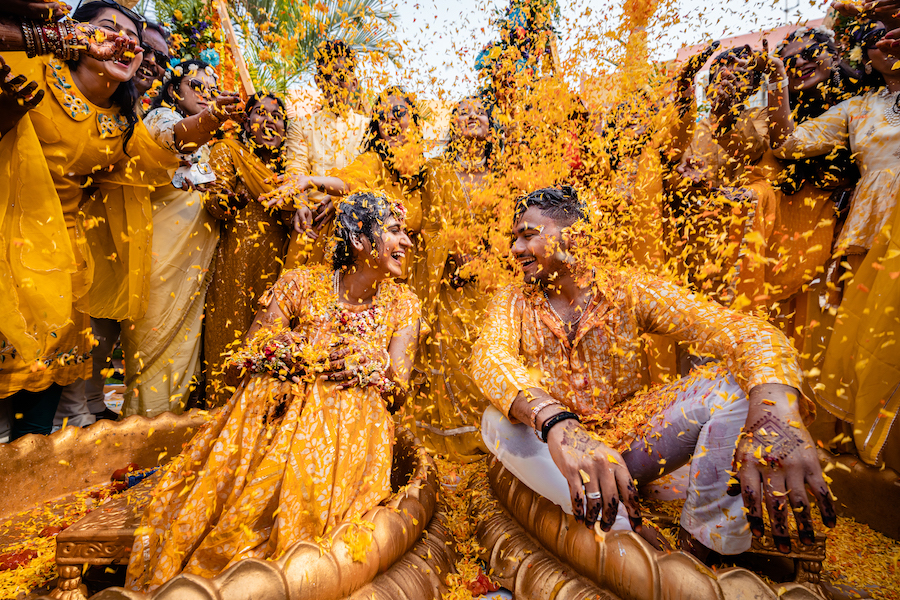
Chetana Bhat Telles, Chetana Bhat Photography

Yellow is a color thought to symbolize happiness — and the colorful confetti and clothing in this image by Chetana Bhat Telles of Chetana Bhat Photography blends perfectly with the couple’s expression. The photographer planned this shot after the pre-wedding events, and because of the confetti, only had one take to get the shot. The photograph was captured with the Sony a7 IV and a 17mm lens.
“Indian weddings [are] all about colors, excitement and fun,” Telles said. “…We gathered a handful of close family members to form a semi-circle around the couple with a handful of flower petals to shower on them on a count of three. (There were no retakes here.) I love how this turned out to be, and bringing out the colors in post-production is blissful since everyone wore shades of yellow and orange.”
Lexi Springer, As The Crow Flies

Rain can deepen the colors in the natural landscape, and the stormy weather on this wedding day inspired photographer Lexi Springer of As The Crow Flies to use both those deeper colors and the wind in this bridal portrait. Springer planned the shot knowing the deeper colors of the rock would help the bride pop even more in her white dress. She captured the image using the Sony a7 IV and a Sigma 35mm f1.2.
“Color is actually my number one goal,” she said. “I have a very bold and colorful style and that can be extremely tricky. So much so that I work with my portrait clients on color palettes that coordinate with location to ensure colors will not clash and be pleasing to the eye. The trickiest part about this editing style is editing orange, yellows and reds! I want the background colors to pop, but I need to ensure that skin tones stay as natural as possible. My editing process takes a little longer because of this, but that is a must for me!”
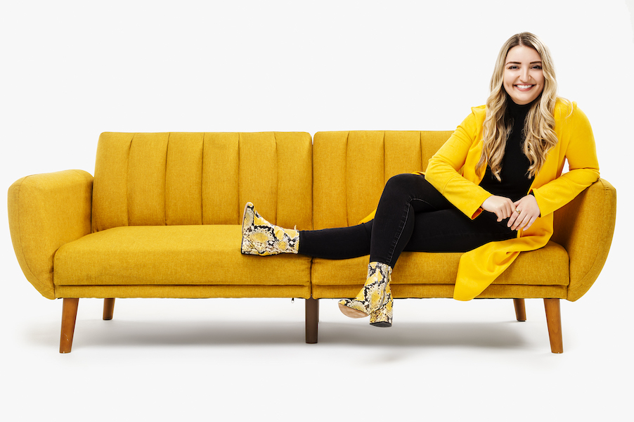
Quame Scott, Q3 Studio

The portrait subject’s favorite color was an inspiration for this colorful studio shot by Quame Scott of Q3 Studio. Scott planned the shoot to promote his new rental studio and invited photographer Lexine Menard to come and have her portraits done in the new studio. Scott was inspired by both Menard’s favorite color and energetic personality — along with a recently donated yellow couch. He took the shot using the Nikon D4 and a 50mm f1.8 lens.
“Color plays a huge role with our emotions and how we respond to various situations,” Scott said. “So, whenever I am trying to elicit a certain response to my pictures or convey a particular message, then color is a major part of that creative process. Warm tones are kind of a standard color range, which is often perceived as very inviting and calming.”
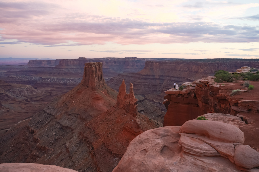
Alina Stobiecka, Out West Elopements
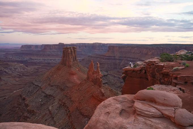
Photographer Alina Stobiecka of Out West Elopements started as a landscape photographer, a background that plays a large role in her work as an elopement photographer. For this image, Stobiecka wanted to capture the grand scale of this scene in Moab by keeping the couple a small part of the scene. She captured the image on the Canon R6 with a 24-70mm f2.8 lens.
“I define my style as a true to life mix of editorial with candid photography,” she said. “I do lean towards warmer tones but always try to stay true to natural colors. Sunsets are my favorite because of the light and the warm hues. In this particular photo, the golden light painted the sky in a beautiful orange and pink which enhanced the color of the red rock in that area of Moab.”
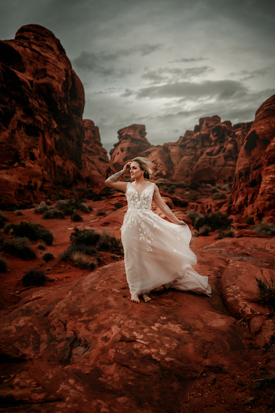
Henry Batdeleg, Henry Bat Photography

Using opposite colors from the color wheel adds pop to a photograph — the blue dress in this image by Henry Batdeleg of Henry Bat Photography helps the model to stand out against the orange rock formations. The Valley of Fire and Sew Trendy gown inspired Batdeleg to capture this image of model Sydney Best. Batdeleg says he loves using warm tones to add a sense of intimacy and positivity. He captured the shot using a Sony a7R IV, the 135mm f1.8 G Master lens, and light from the StellaPro Reflex S.
“However, there are some challenges when working with warm tones like yellow and orange,” he added. “One of the main concerns is color balance and achieving accurate skin tones. When the predominant color in the scene is warm, it can cast a color cast on the subject’s skin, making it appear unnatural or overly saturated. Balancing these tones in post-processing is crucial to maintain a natural and pleasing look.”
Dig into our Photo of the Day archives for even more timeless photos, eye-catching wedding photos and portraits. Submit your wedding, editorial, documentary and other interesting imagery to: [email protected].
Related Articles

Photos of the Week January 6: Double Exposure
January 6, 2025
The double exposure merges two photos into one, but the technique can bring more than just images together, creating a blend of ideas, perspectives, or concepts. This week, we’re featuring five stunning double exposure images as Photos of the Week. Find inspiration in these shots by Cat Ekkelboom-White, Lucy Schultz, Lindie Wilton, Kristen Hazelton, and Will Khoury. Cat Ekkelboom-White, Wild...
More »

Photos of the Week November 18: Groom Portraits
November 18, 2024
Capturing individual portraits on the wedding day highlights the bride and groom’s personalities separately. Groom portraits should showcase his sense of style and emotions on the wedding day. This week, we asked five photographers to share advice on capturing groom portraits. Find inspiration in this week’s Photos of the Week by Ionut Lucian Ianos, Xiaoqi Li, Matthew Sowa, Samantha Turner,...
More »

Photos of the Week November 11: Film Wedding Photography
November 11, 2024
While many predicted that the digital camera would mark the end of film photography, the traditional method has endured. For many photographers, the unique qualities of film provide a feel that’s impossible to replicate with digital cameras. Others have found that learning film for the first time has brought joy and discovery back into their work. This week, we’re featuring...
More »