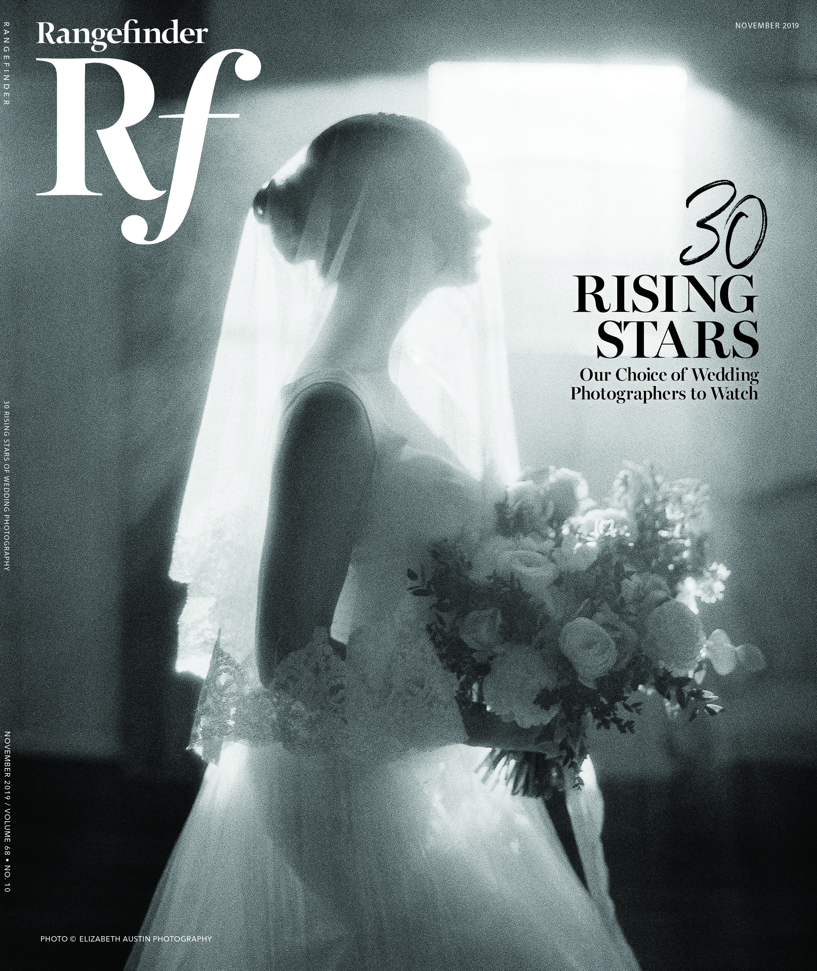
Editor’s Pick: Matt Henry
June 19, 2014
When I first came across Matt Henry’s work, a couple of curiosities immediately caught my eye about the conceptual photographer’s most recent series, “Blue River Falls.” The first is that he has a serious infatuation with 1960s- and ‘70s-era America, yet he was born, raised and is now based in the U.K. Secondly, he purposely pairs two images together to incite perceived narratives, but he refuses to affirm those narratives, nor explain his own—but perhaps for good reason.
“I never explain the story behind my work, I think it closes things down for the viewers,” he says. “Everybody brings their own experiences and builds their own appropriate story. I don’t want to ruin things for them!”
.jpg)
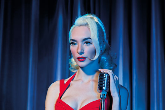
In the series “Blue River Falls,” Matt Henry conscientiously pairs two seemingly separate images together in order to inspire a narrative in the viewer, one he prefers not to specify but concedes that he takes a fairly dark approach. All photos © Matt Henry
His paired images serve a dual purpose, functioning also as an abbreviated form of storytelling. “I felt single images were limiting, but I wanted the ability to tell lots of stories quickly, without having to draw up a large series for each,” Henry says. “The paired images are a great solution; the human mind naturally compares, contrasts and tries to fill in blanks between the beginning and the end.” While Henry may not give any details about the underlying stories behind his image duos, the attested mood he creates in “Blue River Falls” may point the viewer in the right direction. “I’m interested in dark subject matter,” he explains. “I think sometimes there is something in dark subject matter that has beauty and intrinsic worth—like, the correct response shouldn’t be to look away, but to explore.”
To replicate the feel of the ‘60s and ‘70s, Henry builds sets for his shoots, a now-habitual practice that actually began by accident; he eventually found it much easier to construct his vintage-inspired visions from scratch rather than to spend time scouting the perfect locale. “I have quite a graphic, cartoon-like style, so building the sets allows me to control what’s in the image,” he says.
Having complete direction over what and how certain elements play out in each image is especially crucial considering “Blue River Falls” is full of fleeting snapshot stories with somewhat complex psychological underpinnings.
“This body of work began to consider the inherent neuroses that set into relationships and warp our views of the world,” he says. “I liked the idea of portraying a town where the relationships of the entire populace were damaging and destructive in some way. I had a working subtitle of ‘The Town that Love Forgot.’ It’s a kind of supernatural B-movie, I guess, an exaggerated mirror of some of the problems we encounter in relationships with power, lust and jealousy.”
See this story in the digital edition.
Related Articles
AIBP’s Boudoir Photography Competition: The Visionary Awards
August 21, 2024
The Association of International Boudoir Photographers (AIBP) has announced their inaugural edition of the AIBP Visionary Awards, a boudoir photography competition. Since 2009, AIBP has been the leading boudoir photography association, providing a community space for photographers to enhance their craft, build their business, network with colleagues and explore educational resources. Their new competition is accepting submissions from now until...
More »
Legend Elopement Photography Awards: Round 2 Winners
July 30, 2024
The Legend Awards is a photo competition for elopement photographers to show off their documentary photography skills. This article features some of the award winning images from Round 2. See the full gallery of winners here. What stands out in each of the award-winning photos is the emotion and personality of every couple. In these images, we can learn something about...
More »
Icons of Fashion Event with AB+DM & Lindsay Adler
July 24, 2024
Beloved WPPI educator Lindsay Adler will be joining with AB+DM Studio – Ahmad Barber and Donté Maurice – for an exciting weekend event entitled Icons of Fashion. Part lecture and part shootout, this event offers “a behind-the-scenes look into the world of fashion photography and creative mastery.” On the first day, attendees will have access to multiple iconic fashion looks...
More »